
The design challenge
Make deep sorting decisions feel clear on a small screen.
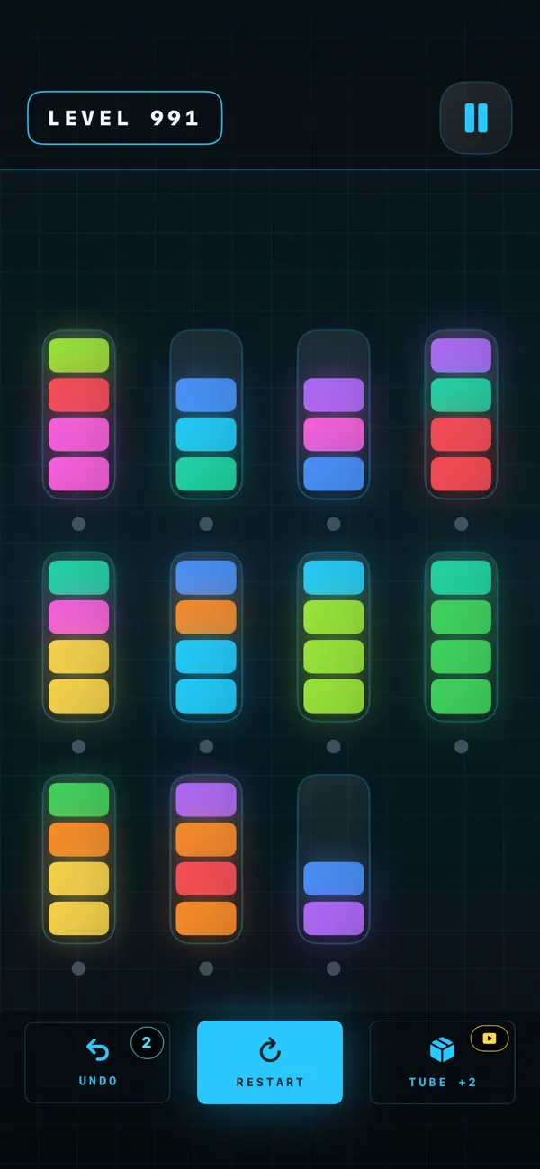
Color-sorting puzzles depend on the player understanding every stack at a glance. As the number of canisters and colors increases, the board must remain readable without making individual cores too small or hiding the controls needed to recover from a mistake.
The larger challenge was turning a repeatable puzzle format into a coherent product. Progression, level identity, completion feedback, optional assistance, monetization, and visual theme all needed to support the central logic instead of distracting from it.
The approach
Keep the logic familiar and make the presentation distinct.
Readable stacks
Bright core colors, contained canisters, and a dark background preserve contrast even on crowded late-game boards.
Planning space
Empty and partially filled tubes become strategic resources, forcing players to plan several transfers ahead.
Safe recovery
Undo and restart controls let players test a sequence without turning every wrong decision into lost progress.
Structured scale
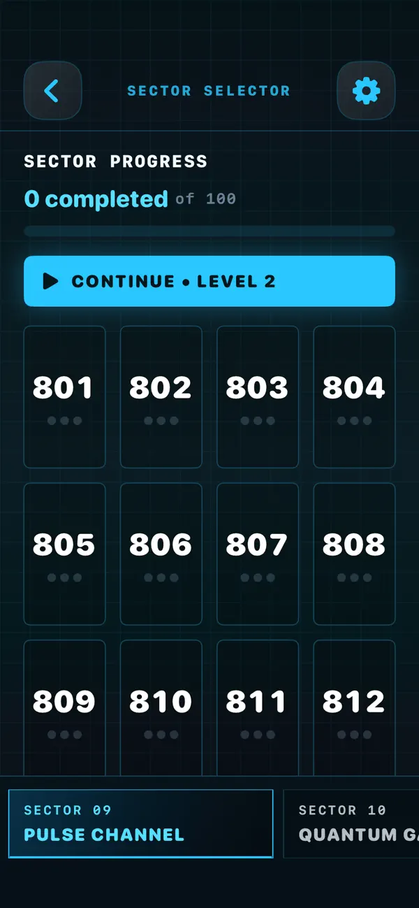
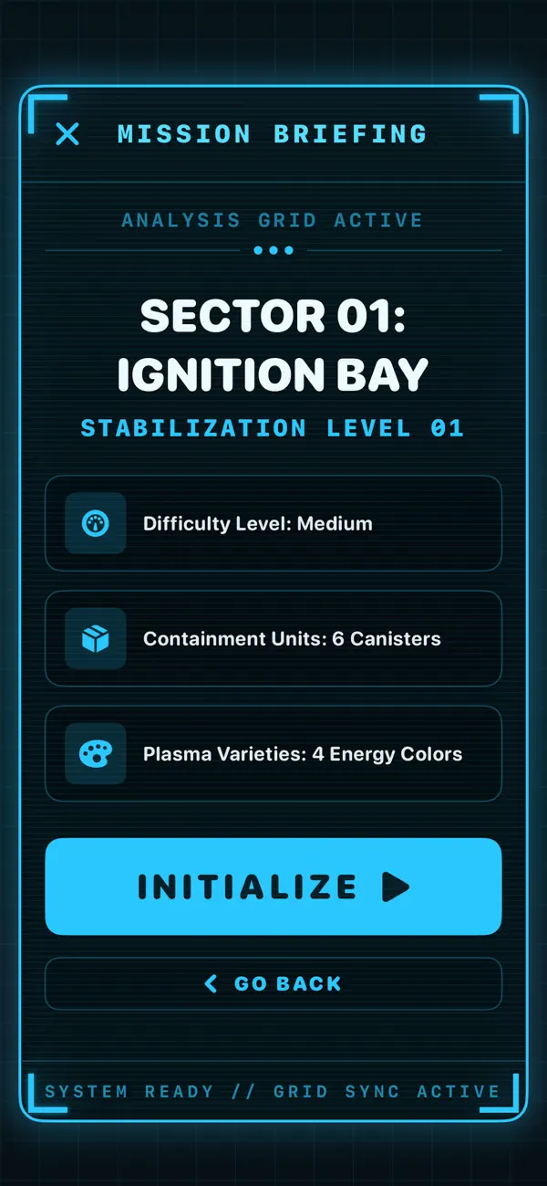
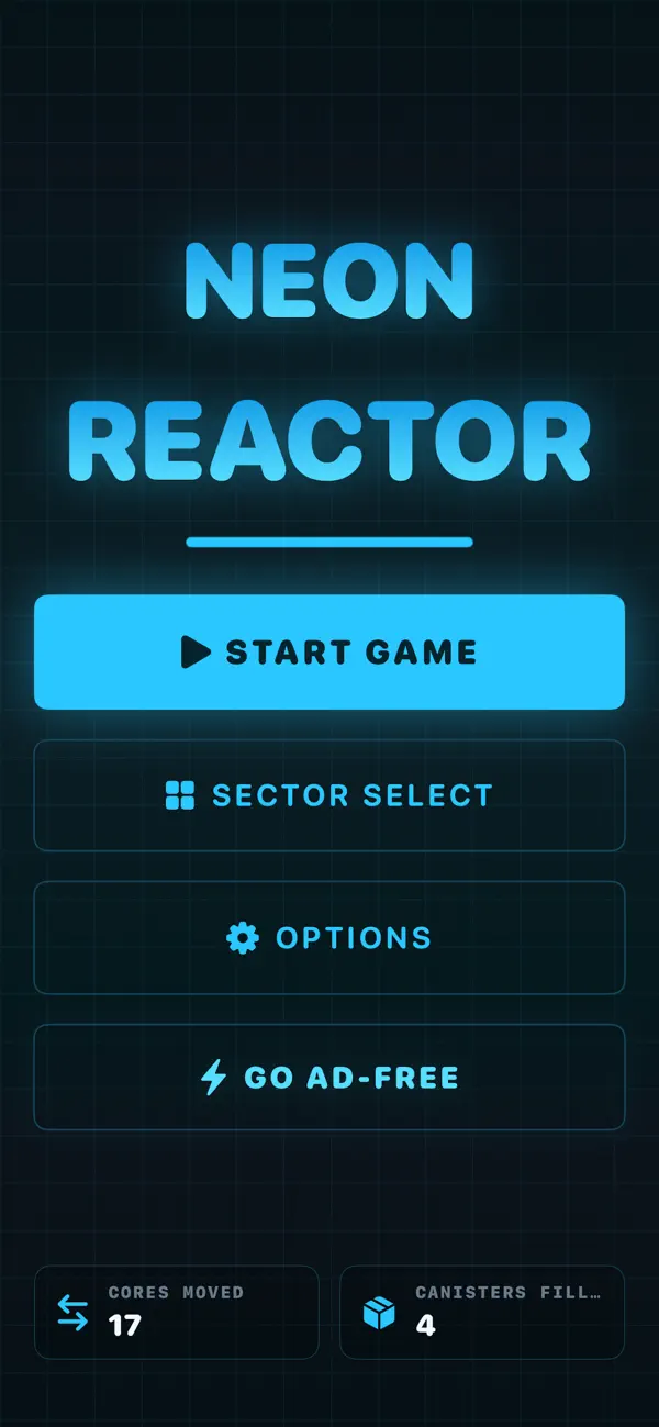
Sectors, mission briefings, numbered levels, and progress summaries make a large puzzle catalog navigable.
Shipping and launch
The first public version delivered the full operating product.
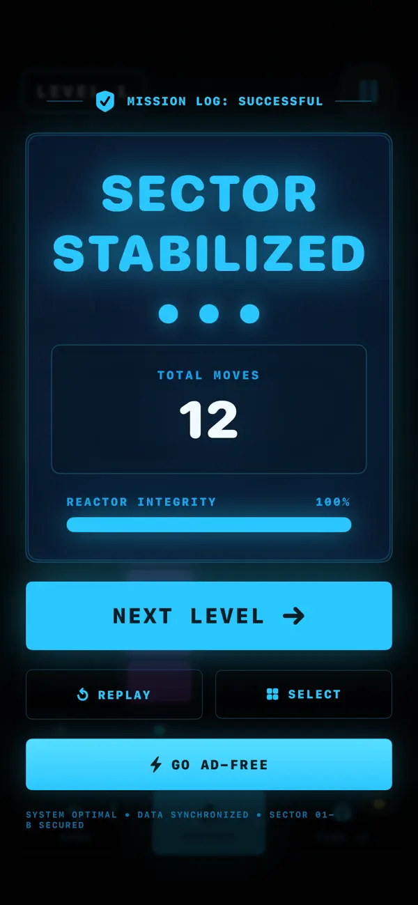
Version 1.0 launched with the complete sorting loop, sector and level progression, mission briefings, undo and restart controls, optional extra-tube assistance, move tracking, completion screens, advertising, ad removal, settings, support, and App Store presentation.
Product operations
The release includes the systems around the game, too.
- App Store presentation and release management
- Large-scale level and sector progression
- Undo, restart, and optional assistance systems
- Advertising and ad-removal purchase implementation
- Privacy disclosures and public support documentation
- Move tracking, settings, and completion feedback